Vodafone Product Page
Creating Vodafone.hu's first responsive page: how we increased tablet conversion by 62%
Why you should dramatically reducing the steps between your landing and your users' goal
See the importance of the responsive design
How we have sticked to branding guideline. Includes before-and-after images of product pages
The Client
Vodafone Hungary is a “child” of Vodafone Group Plc which is the second biggest of the world's leading telecommunications groups after China Mobile, with a significant presence in Europe, the Middle East, Africa and Asia Pacific.
Vodafone Hungary started it’s story 16 years ago. And they didn’t stop since then. Their continuously increasing client base, their competitive offers and their 3G network’s 98,4% national coverage shows their success.
Our shared story started in 2014 on different SEO, analytics and UX tasks and in 2015 they had a brand new campaign, the “Vodafone Family” and our agency had the opportunity to support this project. The next big step was their webshop site build.
The webshop Challenge - Let's Make Things Clear!
The client’s main pain was simple: the Vodafone webshop was complicated. The product pages were hard to understand, little messy and really complex, full of redundant screens.
Our challenge was to turn this site into a user friendly, clear surface, where they can explain the product’s benefits simply and the customers can shop easily or find any information without searching for minutes.
The Solution
Simplicity - Seven At One Blow
It was necessary to communicate the offers in the simplest way. On the original site, you had to get through 7 screens before you could end your purchase. It’s way too much, especially when you could make it by one step. Our design solved this problem.

The same complexity characterized the tariff selector part too. So we fixed it.
Calculator before and after
Responsivity
We had the opportunity to make Vodafone Hungary’s first responsive site. But why is this so important?
Day by day, the number of devices, platforms, and browsers that need to work with your site grows. When it comes to websites the new trend is to go all in on responsive. Make pages that look great at any size, so you will serve anyone at anytime.
1 to rule them all
Sure, you can razzle-dazzle the hell out of your website, but from the user’s perspective, there’s one thing that will always be more important than anything else. Bet you know it. (“That’s a pretty nice site with these cool mobiles, but how much they will cost?”)
THE PRICE. It’s essential to see the price immediately! Especially, when it’s 1 HUF. That’s a thing you should highlight.
04
The Result
Thanks to our new, simple and effective website for every screen we significantly decrease the bounce rate of Vodafone’s webshop.
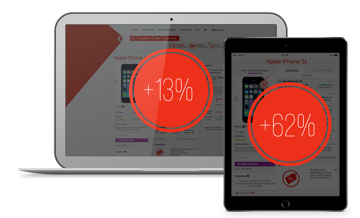
The conversion rate on desktop increased +13% and on tablets +62%.
Will these techniques work on your business?
Some of these techniques may not work on your site, but don’t worry, we believe that many of them will.
What is your next step?
If you'd like us to improve your website, visit: