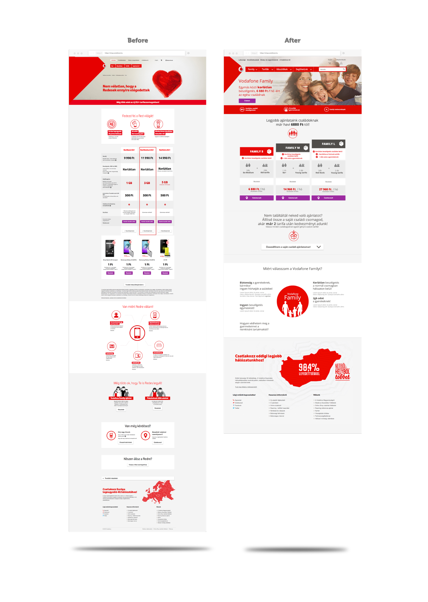
Vodafone Family
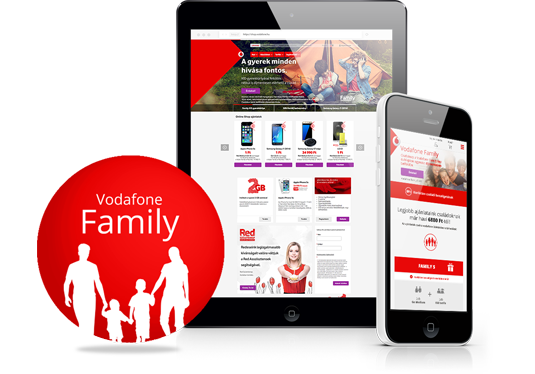
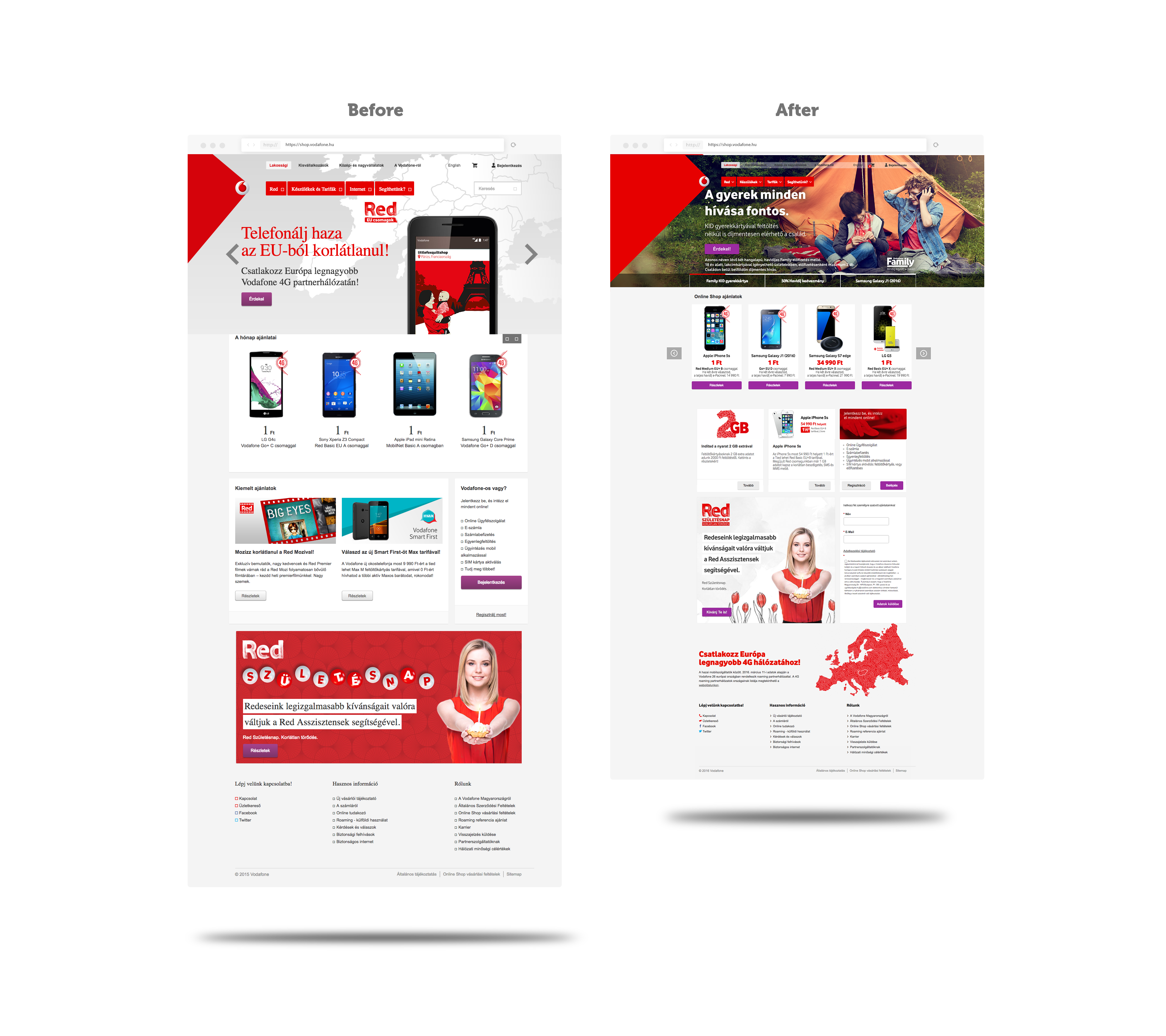
Creating a cross-channel Vodafone Family Landing page, which awarded us the challenge to redesign the Vodafone.hu homepage
How to steer users from a simple online calculator to complete their purchase in the offline shops
Why you shouldn’t assume that your customers want to puzzle out complex informations
The importance of hierarchy and comprehensive icons
Includes before-and-after images of the landing page
The Client
Vodafone Hungary is a “child” of Vodafone Group Plc which is the second biggest of the world's leading telecommunications groups after China Mobile, with a significant presence in Europe, the Middle East, Africa and Asia Pacific.
Vodafone Hungary started it’s story 16 years ago. And they didn’t stop since then. Their continuously increasing client base, their competitive offers and their 3G network’s 98,4% national coverage shows their success.
Our shared story started in 2014 on different SEO, analytics and UX tasks and in 2015 they had a brand new campaign, the “Vodafone Family” and our agency had the opportunity to support this project. The next big step was their webshop site build.
THE UX CHALLENGE - Simple as that
Vodafone had a complex, hard to understand offer for families, and they needed a specific site for it, where they can explain the benefits and prices simply, in a user friendly way.
The main goal was to guide the user through the offer labyrinth in the easiest way as possible.
Besides it had to be crystal clear, we had to follow the Vodafone’s strict brand guide. Our challenge was to find out how to follow Vodafone design guidelines, while simplifying the process for the user as much as possible.
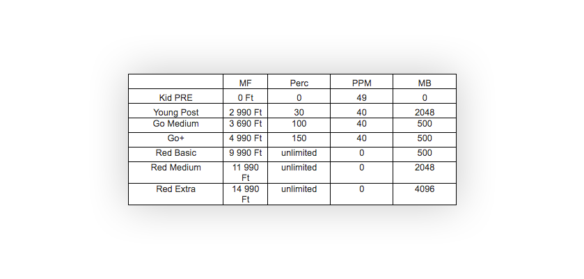
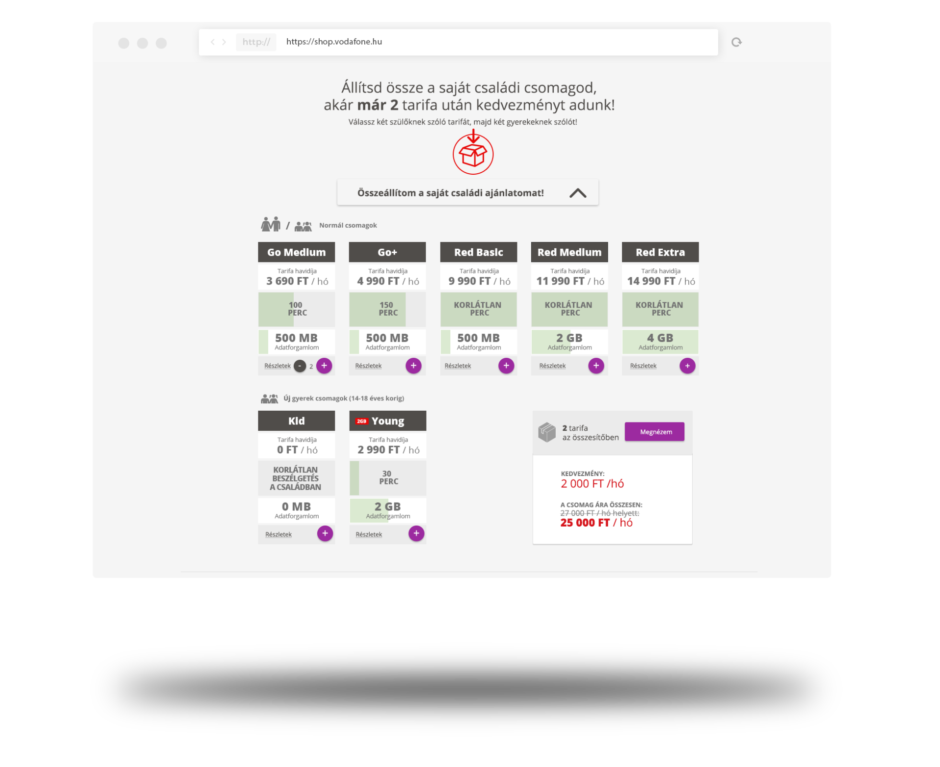
Initial Vodafone Family calculator table
The Solution
Hierarchy
We split the initial table into two parts, one with tariffs for only children and youngsters, and one for everybody. This hierarchy with the visualisation about how much data or minute is included in each tariff made the understanding of the calculator more intuitive.
The secret ingredient is consistency. Our site’s rested on 4 elements.
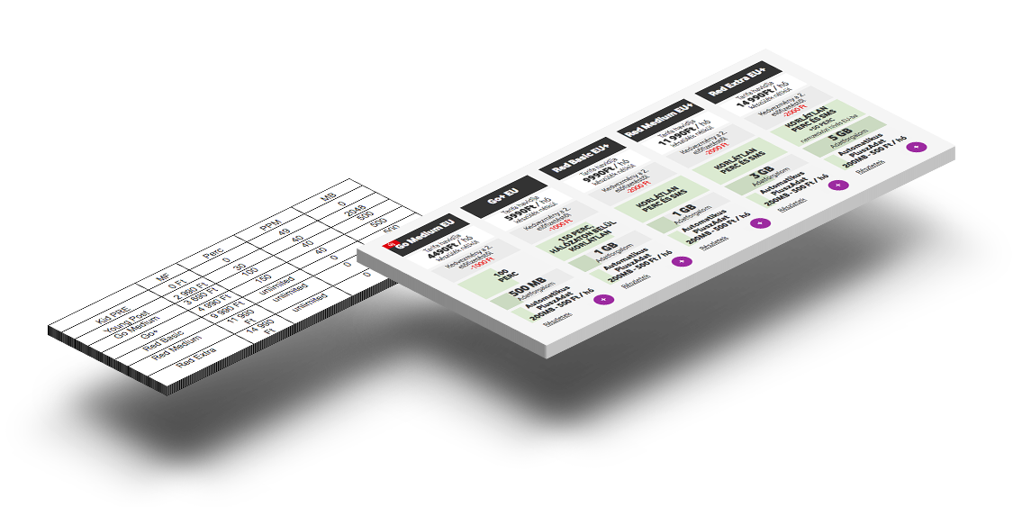
Initial calculator table vs. landing page calculator
Icons
It was challenging to visualize some details of the offer, so we used icons to make it clear which tariff is for children only.
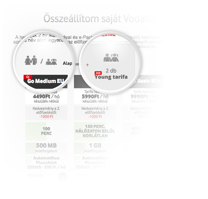
Discount calculator
With Vodafone’s ideas and help we made the specific discount calculator, to help users find the perfect offer for themselves.
Calculator on the Vodafone Family landing page
Matching design
Vodafone have a strong brand design guide, which we had to be respect and follow. It’s harder than you think to go by an existing image with strict limits.
Vodafone Family before and after
04
The Result
As we expected the renewed landing page accomplished its most important aim: to be simple, clear and user friendly. Thanks to that result, Vodafone charged our team to perform an even bigger and more exciting job, the Vodafone main page too. That’s not a secret, it went pretty well too.
Will these techniques work on your business?
Some of these techniques may not work on your site, but don’t worry, we believe that many of them will.
What is your next step?
If you'd like us to improve your website, visit: